Navigate to Participation History
You’ll find Participation History under the “reports” section of the main menu.

Defining Engagement Benchmarks
iMentor’s engagement benchmarks are most easily understood in the context of individual (or pair) benchmarks and programmatic (or aggregate) benchmarks to be met by the end of the program year.
- Individual benchmark: Mentor-mentee pairs complete at least 65% of lessons assigned to them AND meet in-person at least six times per year
- Programmatic benchmark: 65% of mentor-mentee pairs meet the individual benchmark
Throughout the different tabs of Participation History, you will see various reference points to the programmatic benchmark.
- Summary tab -> Week over week lesson engagement line graph: There is a flat reference line at the 65% point to put online engagement into the context of the programmatic benchmark.

- Summary tab -> Year to date in-person meeting distribution bar graph: Pairs that have met 6 or more times are grouped together, as 6 represents the programmatic benchmark for pair in-person meetings. Values are colored in gradient fashion, from red for pairs that have not met to green for pairs meeting the benchmark.

Tabs within Participation History

- Summary tab: This tab provides a high-level representation of pair engagement to quickly evaluate program performance across all schools. Review this Learning Center article to learn more.
- Here you will see:
- Total number of matched pairs
- Year-to-date percentage of pairs at/above the online engagement benchmark
- Weekly online engagement trends: The line graph provides you with a visual of the percentage of pairs meeting the online engagement benchmark each week throughout the program year
- Year-to-date in-person meeting distribution: This bar chart displays the percentage of pairs who have not met, met once, met twice, etc.
- Here you will see:
- Program Performance by School or Cohort: Managers can set filters for the specific schools or cohorts that they oversee. By reviewing and comparing data between schools or cohorts, managers can identify schools or cohorts with strong participation trends and apply strategies that have been proven successful to schools or cohorts that need improvement.
- You will need to adjust filters in order to review this information.
- Select the “Cohort and Class” tab.
- Using the filters on the right hand side, select the School or Cohort you would like to view.
- You will need to adjust filters in order to review this information.
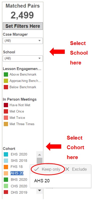
- Once you select the School or Cohort, click back to the “Summary tab” and you will see the participation data for that specific school or cohort.
- Any filters selected will be applied across all tabs until you reset the filters.
- Reset filters by clicking on the “Revert” button, which can be found on the bottom of the page.

- Case Managers tab: This tab allows managers to review program participation down to the program manager level. Managers can set filters for the specific program manager or school they oversee. Review this Learning Center article to learn more.
- Here you will see:
- Total number of matched pairs
- In-person meeting distribution: The pie chart(s) display(s) the percentage of pairs that have not met, met once, met twice, etc. by the program manager.
- Week over week lesson engagement: The line graph visualizes the percentage of pairs meeting the online engagement benchmark each week throughout the program year.
- Things to pay attention to:
- In-person meetings: Using the pie charts, managers can quickly identify for each program manager they oversee the percentage of pairs and which pairs have not met or are not on track to meet the in-person meeting benchmark. Using this information, managers can bring this up during check-ins with program managers and discuss strategies.
- Online engagement: Managers should take note of any downward trends in a specific program manager’s lesson engagement line graph and bring it up during check-ins.
- For program managers that have a static trend line, this is also an opportunity to discuss strategies for improvement of their pairs’ online engagement.
- Here you will see:
- Cohort and Class tab: This tab allows managers to review participation down to the class and cohort level, which will allow them to better understand why program-wide participation looks the way it does. Review this Learning Center article to learn more.
- Here you will see:
- Total number of matched pairs
- Pairs at/above lesson engagement benchmark: The bar chart(s) display the percentage of pairs meeting the weekly online engagement benchmark by class.
- In-person meeting distribution: The pie chart(s) display the percentage of pairs that have not met, met once, met twice, etc. by cohort.
- Week over week lesson engagement: The line graph displays the percentage of pairs meeting the online engagement benchmark each week throughout the program year by cohort.
- Things to pay attention to:
- Online engagement:
- Using the bar charts, managers can identify which classes are meeting or not meeting the online engagement benchmark. Managers should regularly review this information for the program managers that they oversee and use this information during check-ins to determine which classes to focus on.
- Using the line graph, managers can identify and compare trends in online engagement across cohorts. Managers should take note of any upward or downward trends for a cohort and then dig deeper to understand the factors behind the change.
- A static trend line is also a reason to dig deeper so managers can work with program managers to develop strategies to create upward movement.
- In-person meetings: Using the pie charts, managers can determine which cohorts are on track or not on track to meeting the in-person meeting benchmark. Managers can use this data to help program managers identify which pairs to focus on for upcoming events.
- Online engagement:
- Here you will see:
- Mentees and Mentors tab: This tab allows managers to review online engagement down to the mentee and mentor level. Review this Learning Center article to learn more.
- Here you will see:
- Total number of matched pairs
- Week over week lesson engagement: This line graph displays the percentage of mentees and mentors, respectively, meeting the online engagement benchmark each week throughout the year.
- Year-to-date lesson engagement benchmark: This table shows the percentage of mentees, mentors and pairs meeting the online engagement benchmark broken down by class.
- Things to pay attention to:
- Managers can use the filters to view mentor and mentee trend lines for the specific program manager(s), school(s) or cohort(s) they oversee.
- Managers can compare trend lines or the data in the table to determine whether mentors or mentees are outperforming one another. Managers can then work with program managers to determine where to best focus their efforts to increase online engagement.
- Here you will see:
How to “get behind the data”
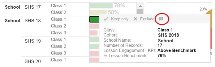
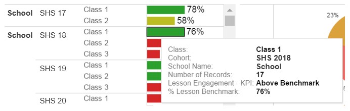
Across all tabs, within every line graph, bar chart, pie graph or table, users can “get behind the data” by using hover-over functionality. Pay attention to the "number of Records" in the hover-over pop-up window below, as the number of pairs in a dataset provides key context for the participation numbers.
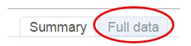
When you click on a point on a line graph, a bar on a bar graph, etc., you can also export the data into an Excel Document. You can then filter or segment the data in any way you like to better understand what is going on. This is a great way to identify high-performing or low-performing mentors, mentees or pairs.
- Click on the icon (circled in red). This will open a pop-up window.
- Click on “Full Data” tab and then “Download all rows as text file”